
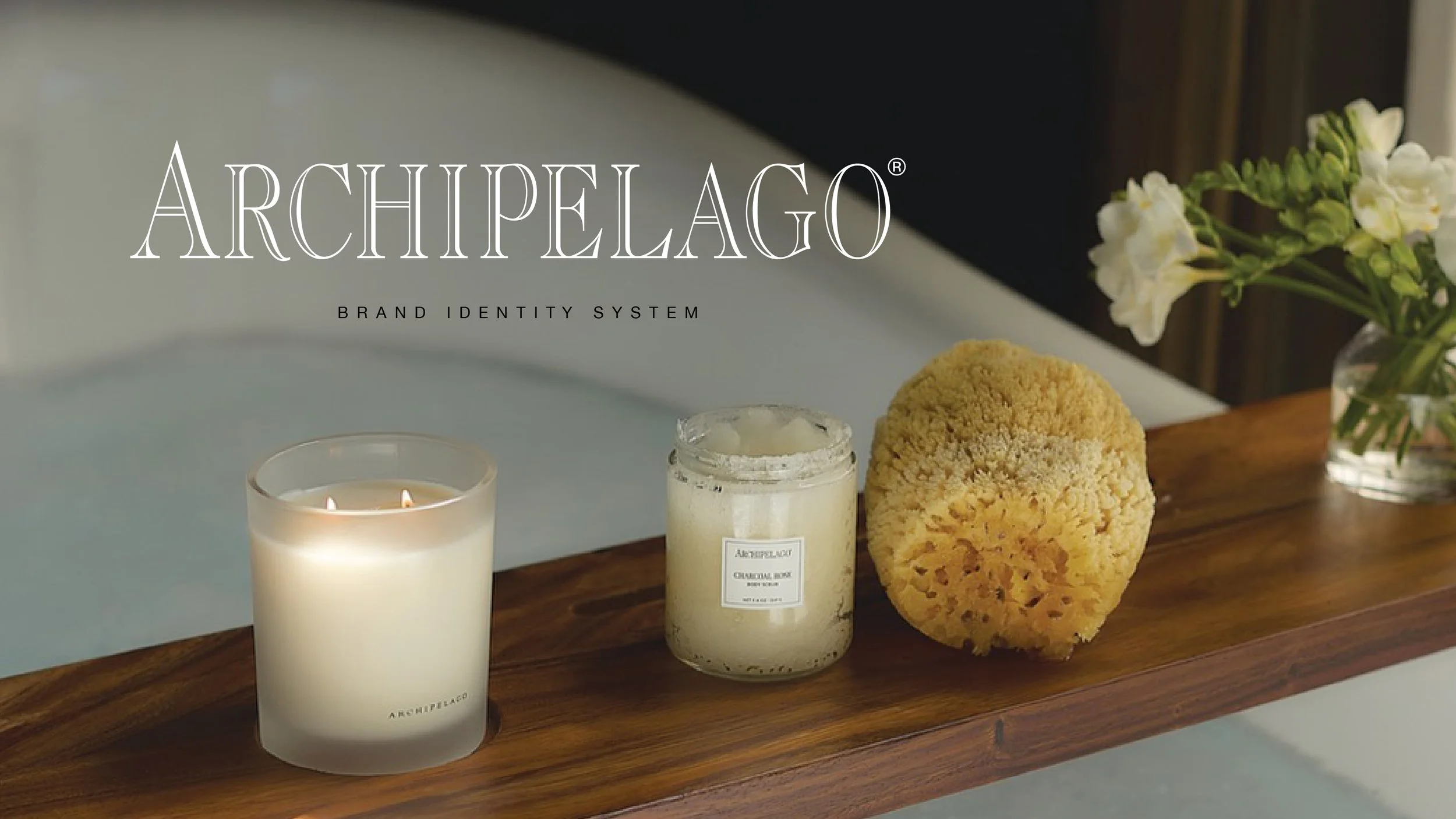
Archipelago
Brand identity and packaging redesign for a family-owned, longstanding Los Angeles–based fragrance house. I designed and directed a comprehensive identity system that brought clarity, cohesion, and longevity to a complex product ecosystem.
Role
Lead Art Director &
Brand Designer
Year
2021
The Challenge
Founded in 1998, Archipelago was a longstanding, family-owned fragrance house rooted in craft and botanical ingredients. When the brand began shifting from a primarily wholesale model to direct-to-consumer, its visual identity had not yet caught up with the scale or complexity of the business.
Years of disconnected packaging, dozens of logos, and the absence of formal brand guidelines made it difficult to present a cohesive story across products, digital channels, and retail environments. At the same time, the brand needed to expand into email, e-commerce, and social while still supporting wholesale partners and trade shows.
The challenge was to create a unified brand identity that honored Archipelago’s origins in a small Santa Monica garage while giving the business the structure it needed to grow across channels and hundreds of SKUs.
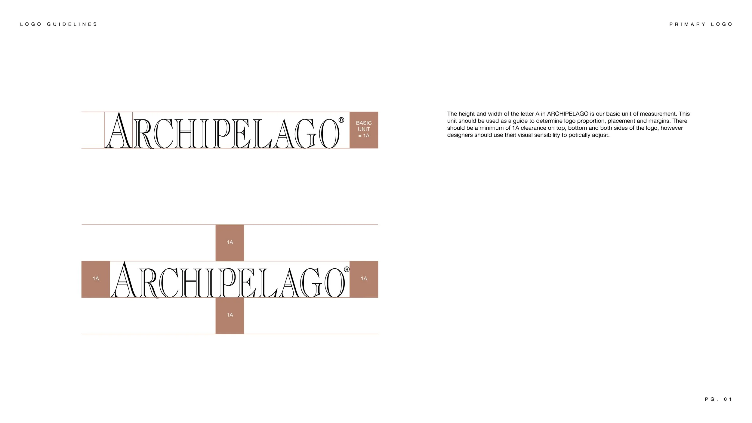
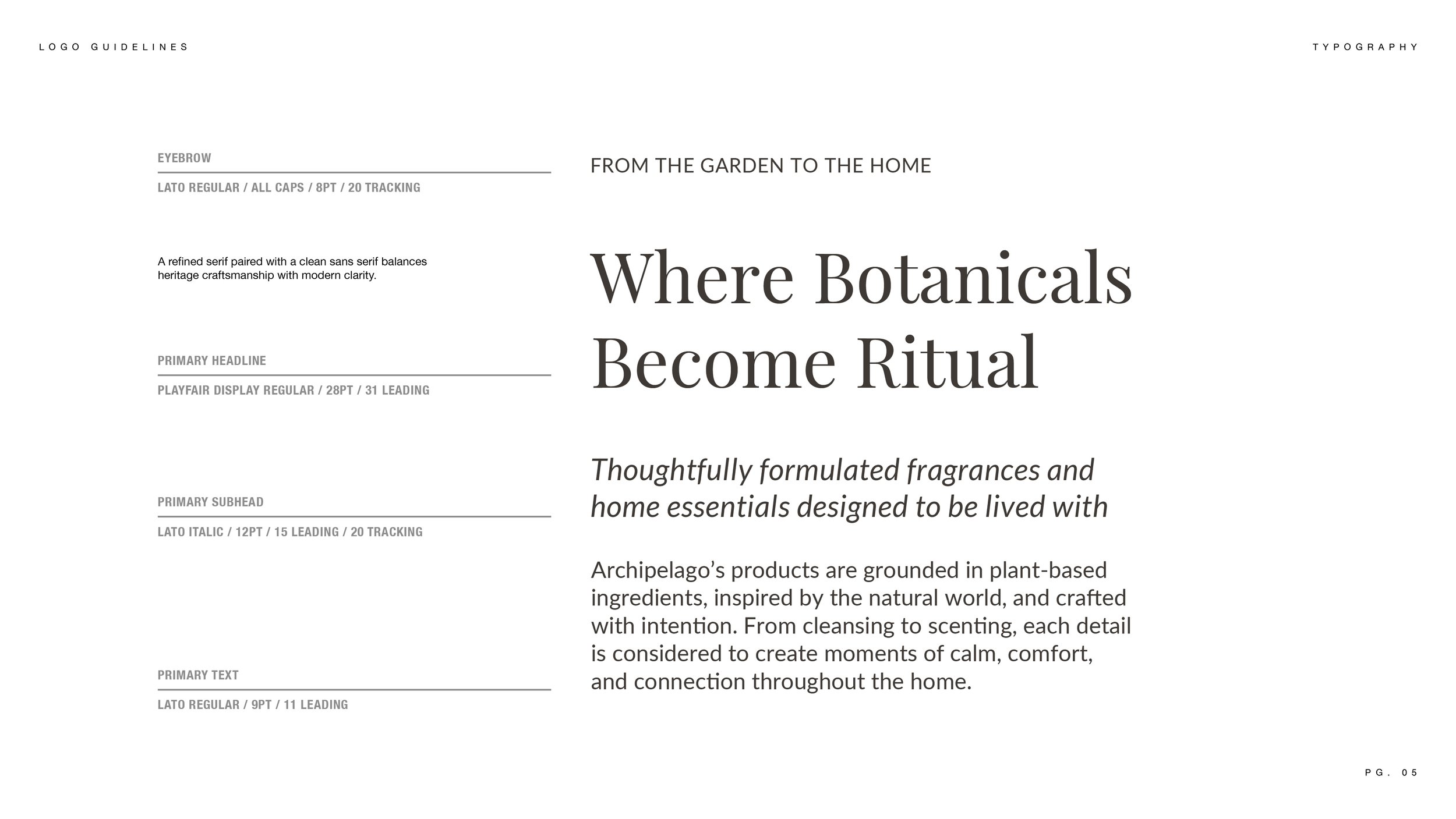
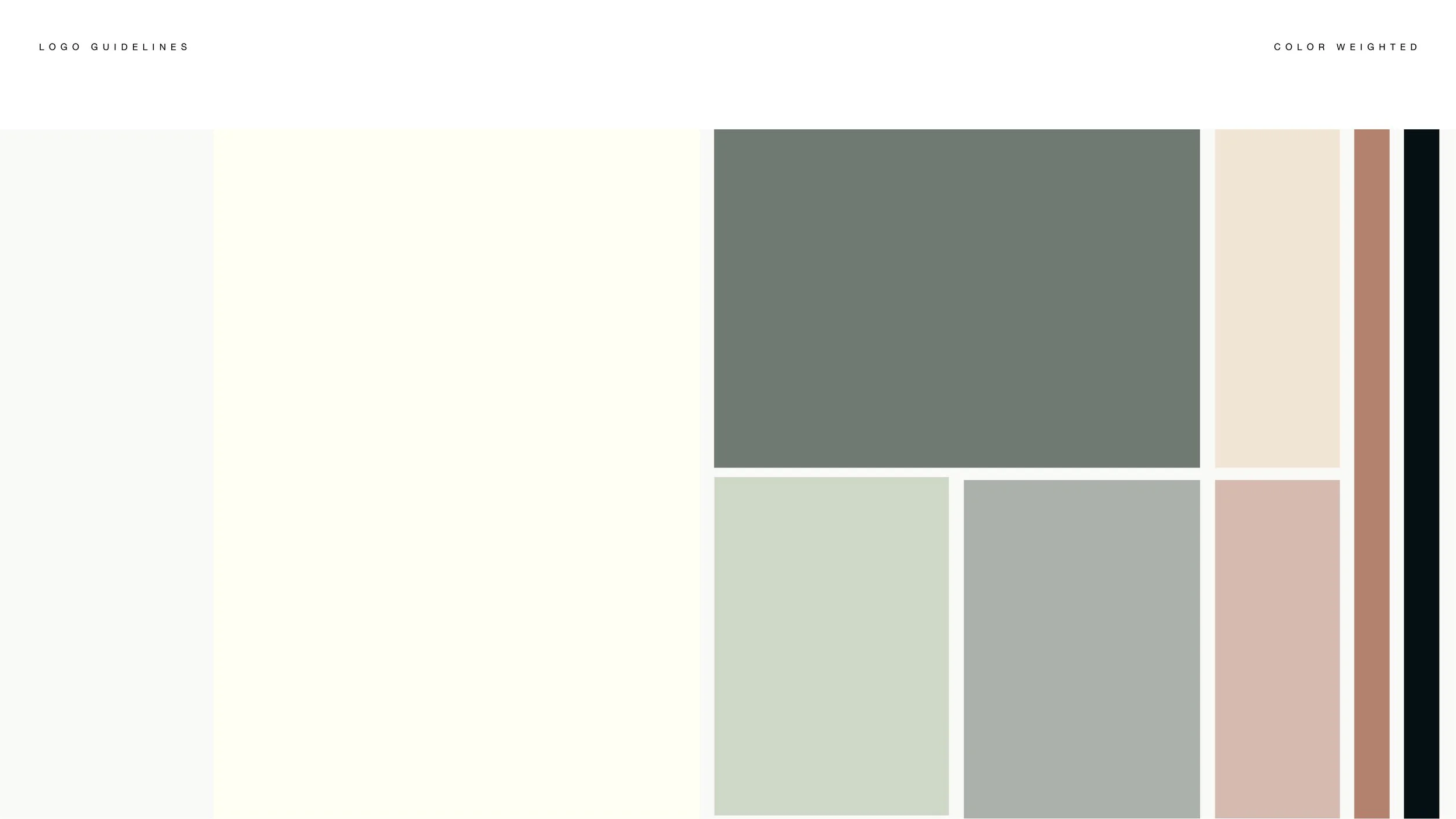
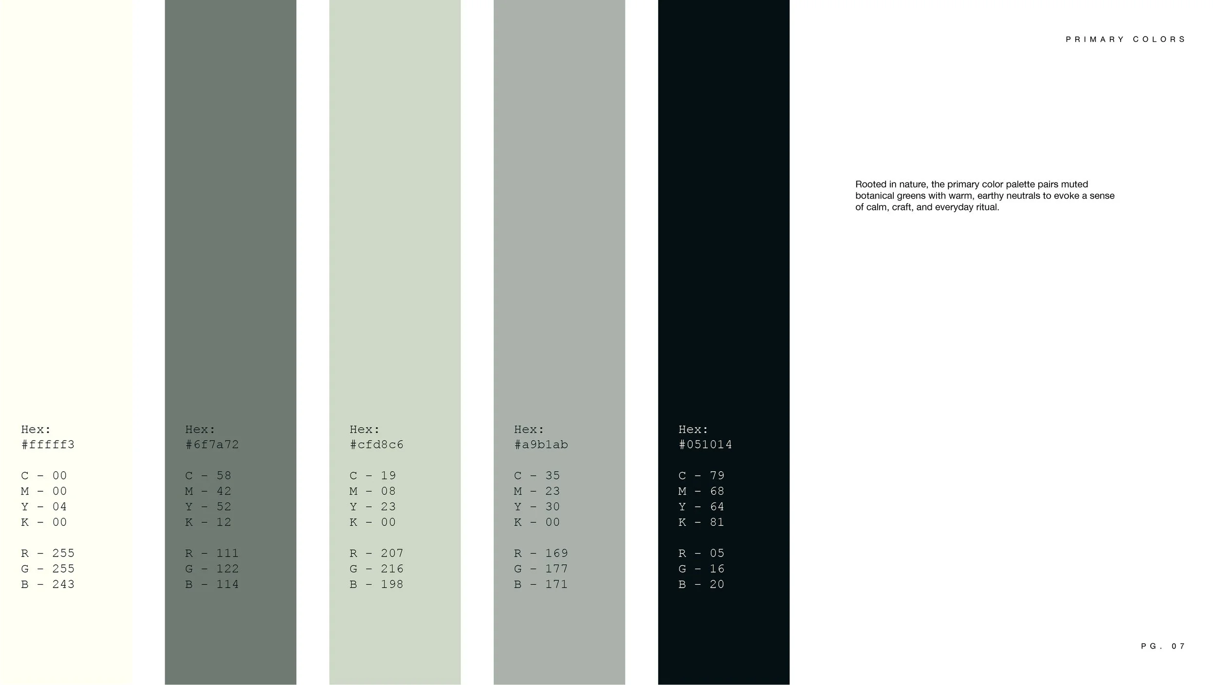
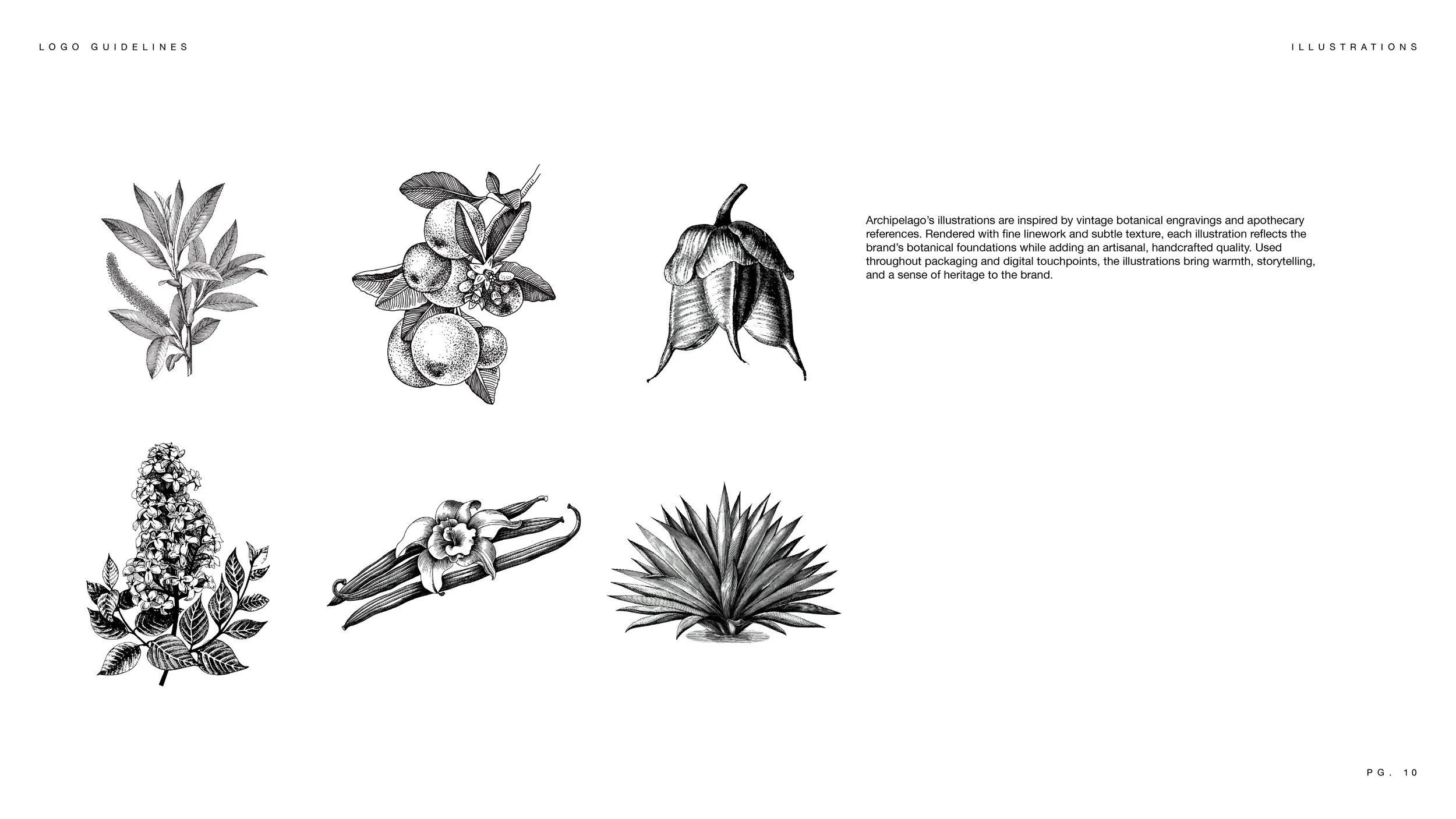
Before any redesign could happen, the brand needed a clear foundation. Establishing formal brand guidelines became the first step in bringing consistency, structure, and scalability to a rapidly growing product ecosystem.
Bringing the Identity to Life
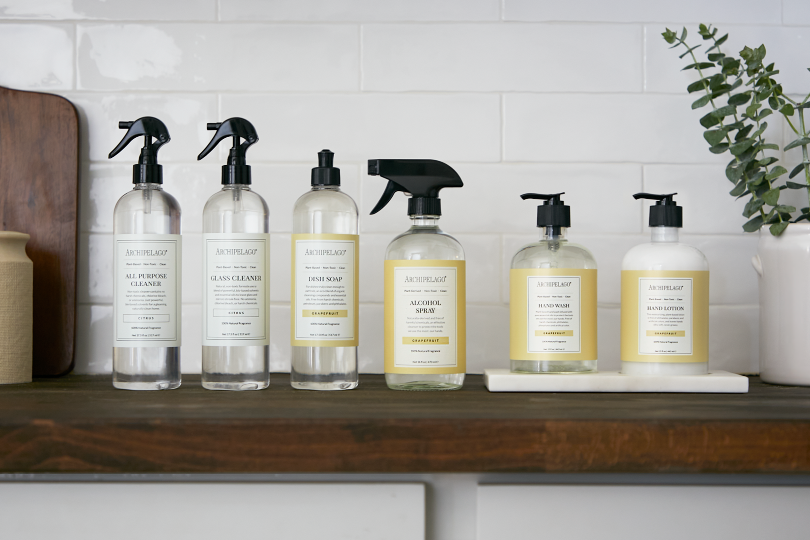
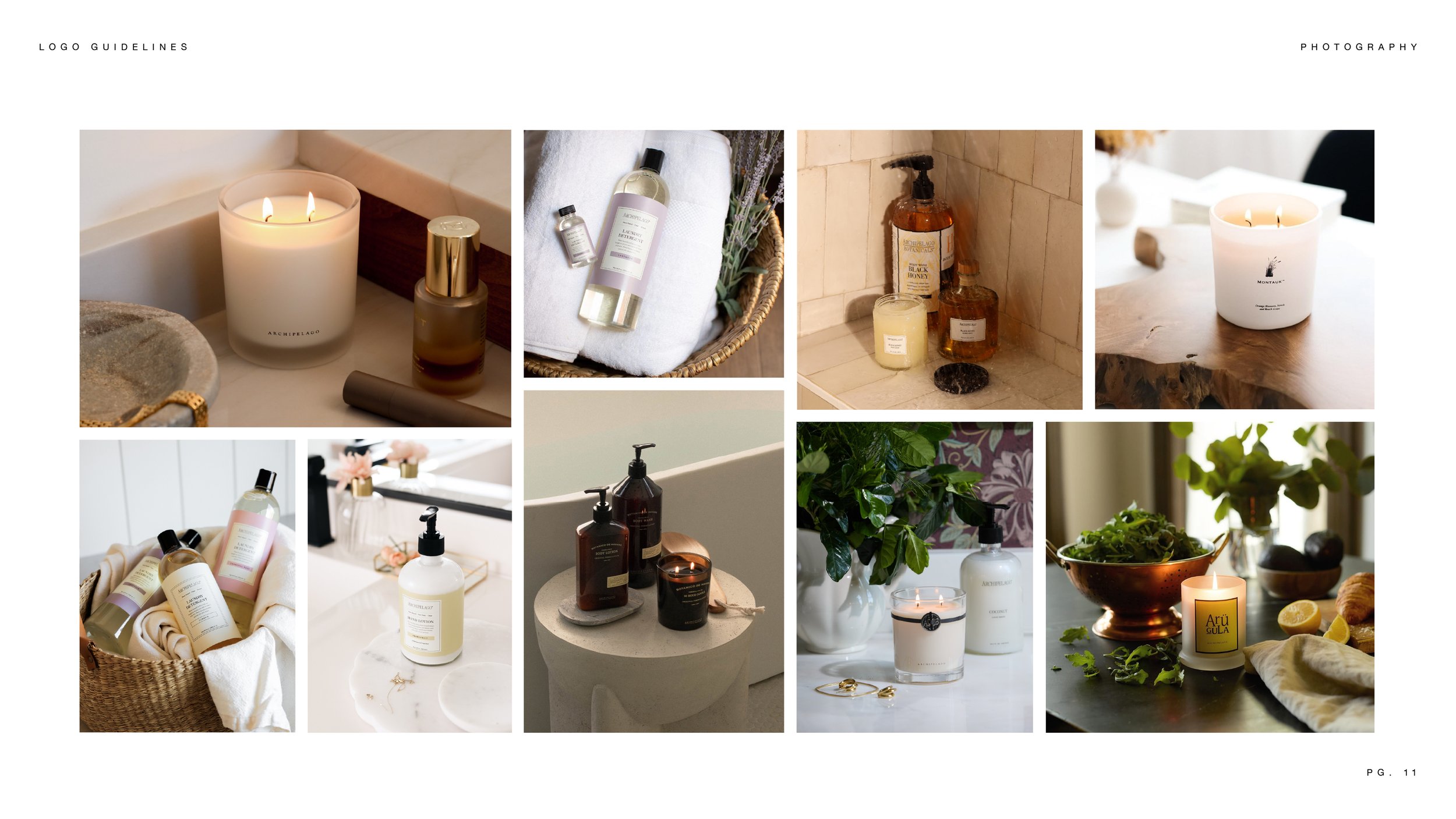
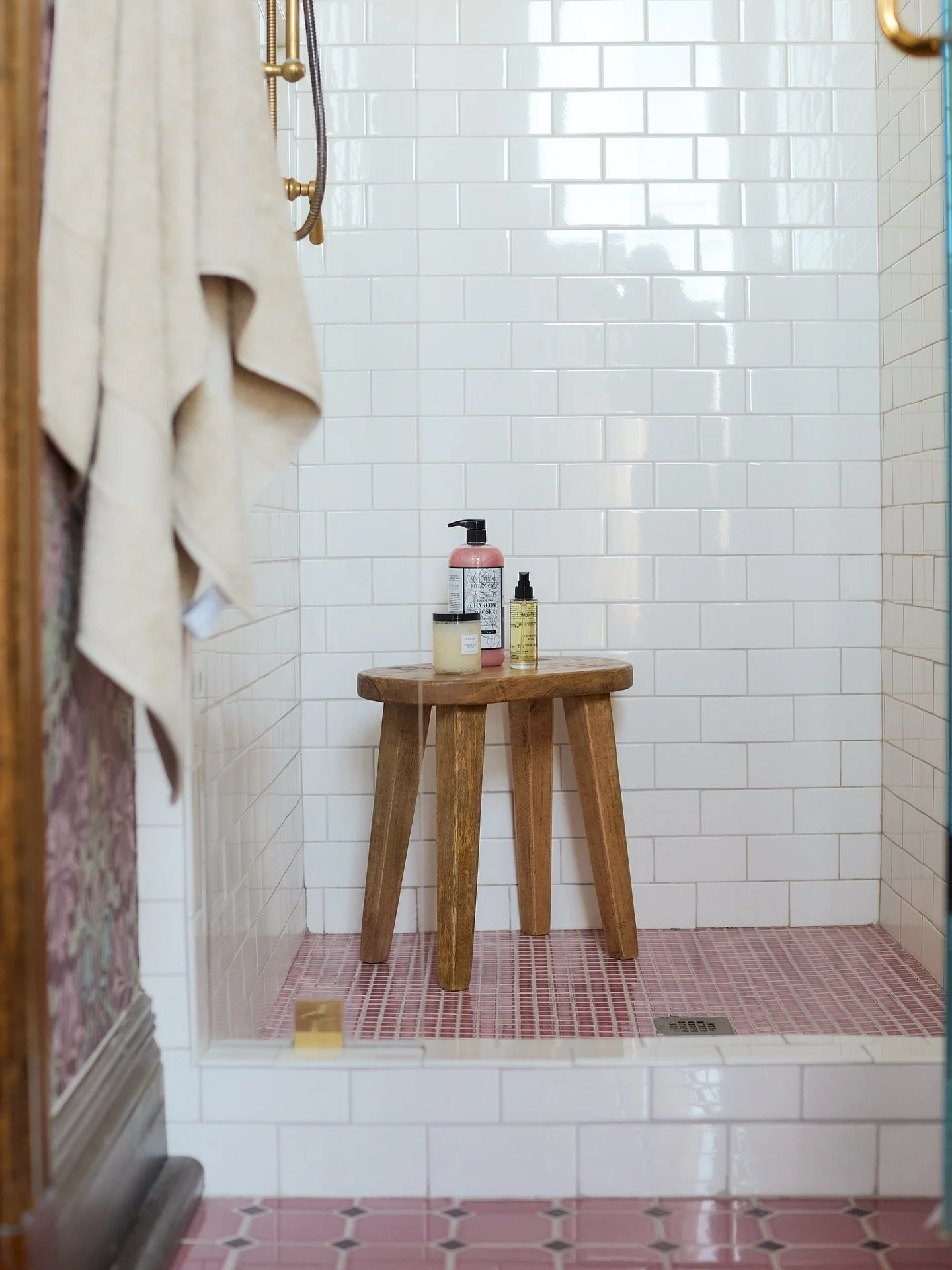
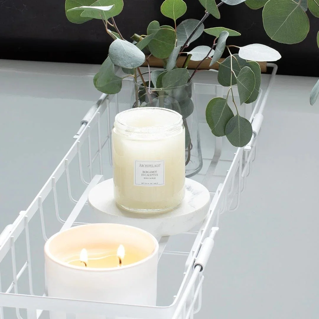
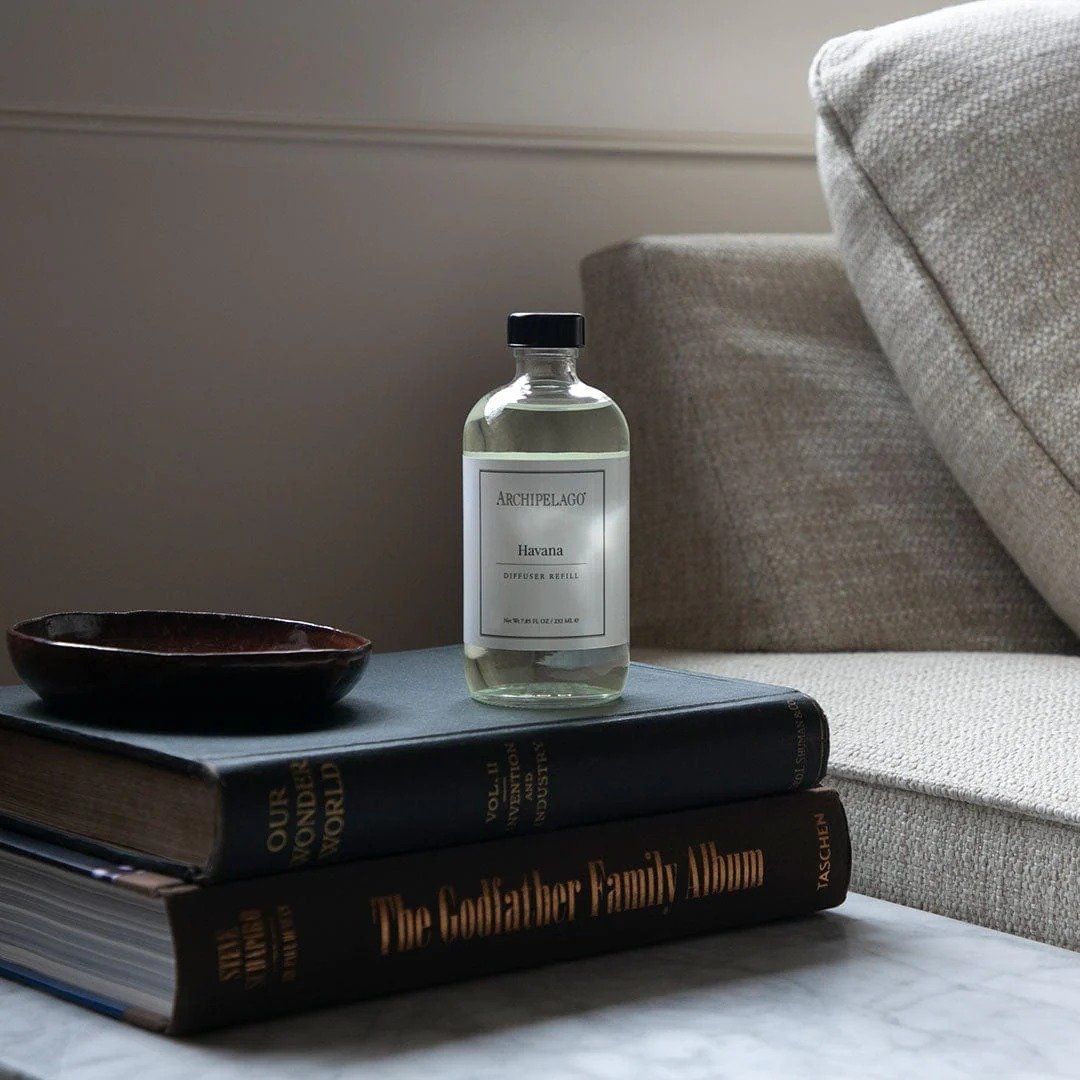
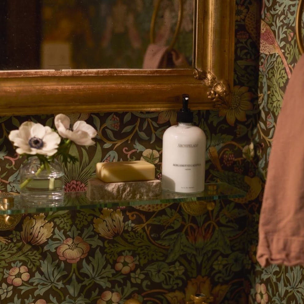
The Archipelago identity was built as a scalable system meant for daily use. Applied across packaging, photography, and digital channels, it brought consistency and structure to a broad product offering while preserving the brand’s approachable, lived-in aesthetic.


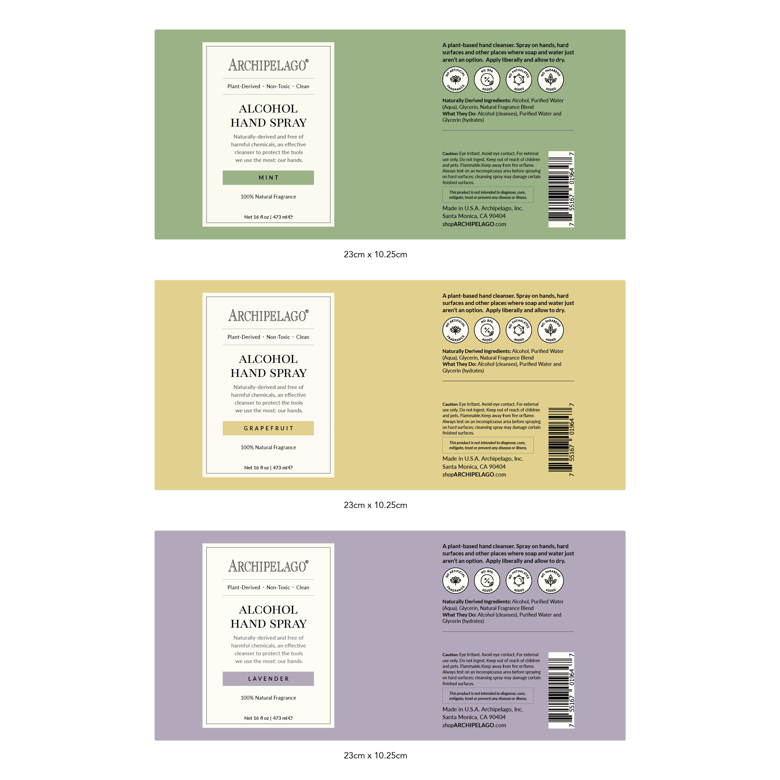
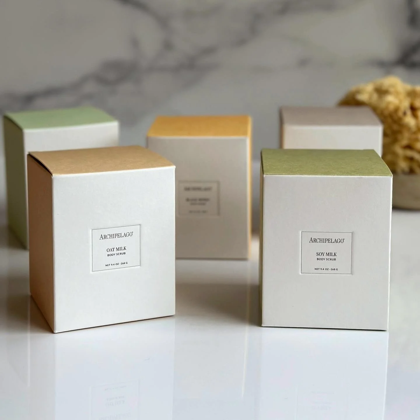
With the identity established, the system was translated into packaging designed to scale. Standardized dielines, typography, and hierarchy allowed hundreds of SKUs to live cohesively across categories and fragrance families.


The identity was carried into a digital experience designed for clarity, discovery, and scale. The website reinforced the brand system while supporting a broad and growing product offering.
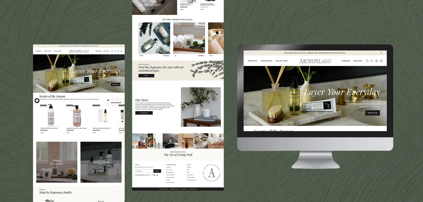
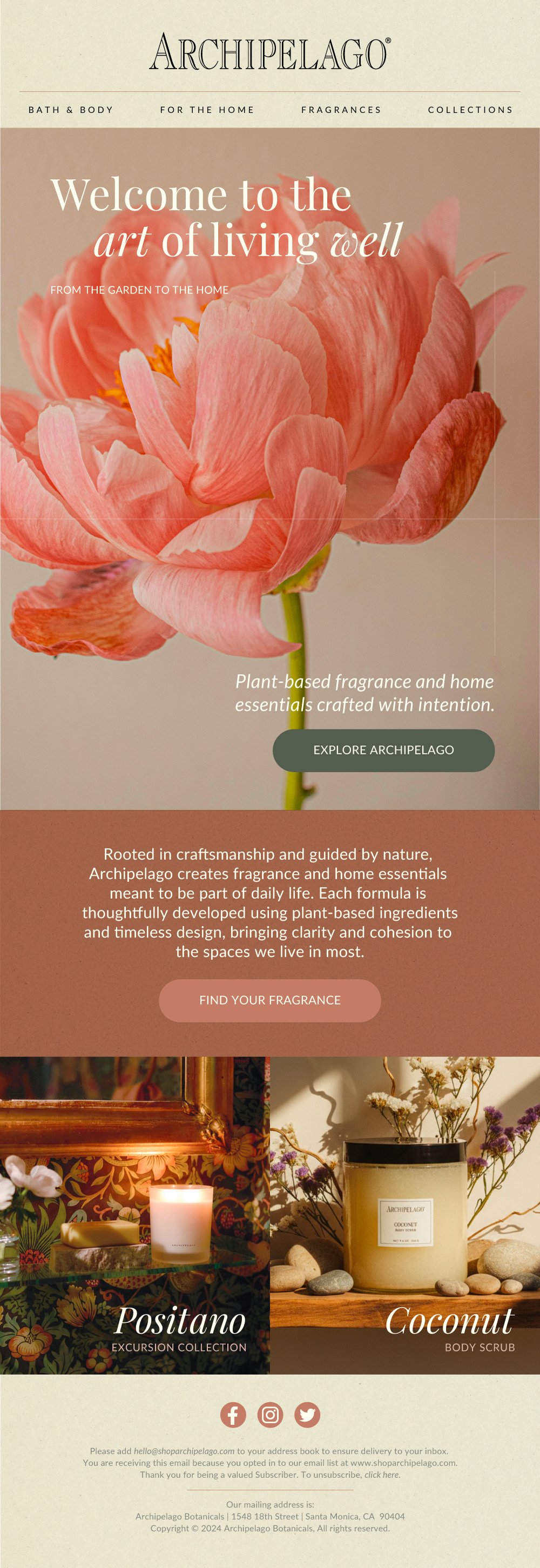
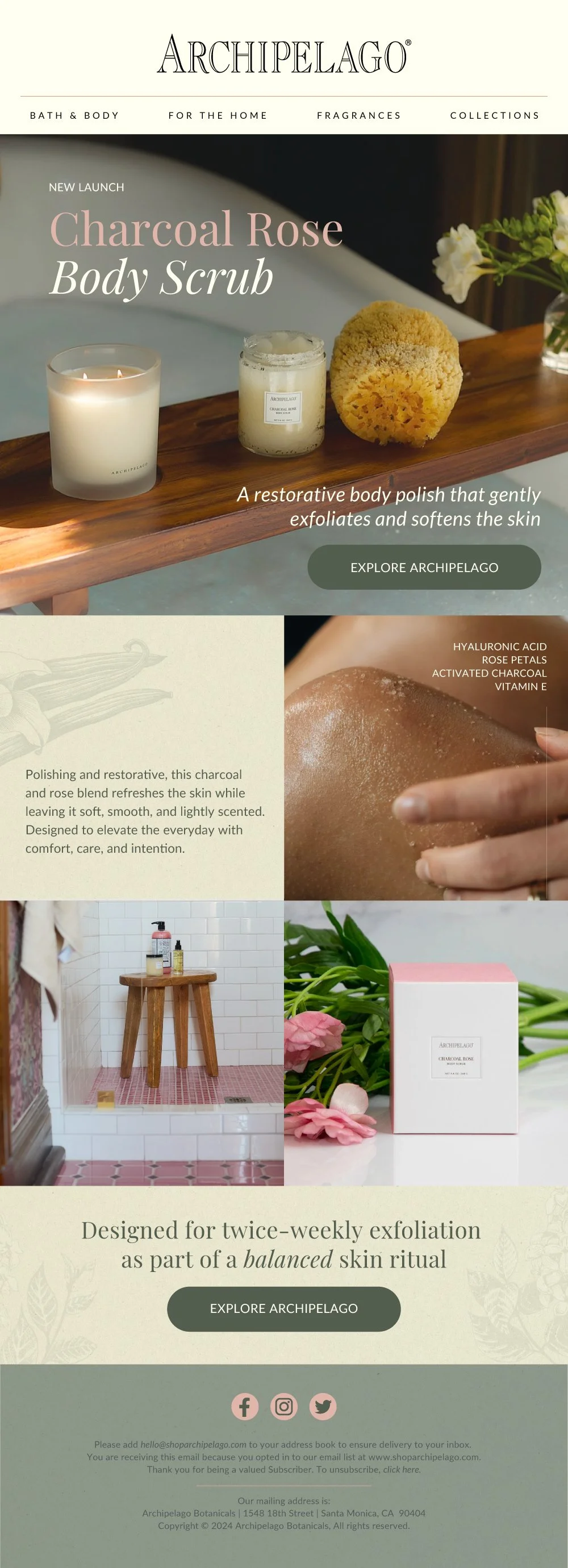
With the website established, email became a critical extension of the direct-to-consumer experience. I designed and built email flows in Klaviyo, working closely with the marketing team to test and refine layouts and messaging, ultimately developing a repeatable system that could adapt across campaigns, products, and customer touchpoints.

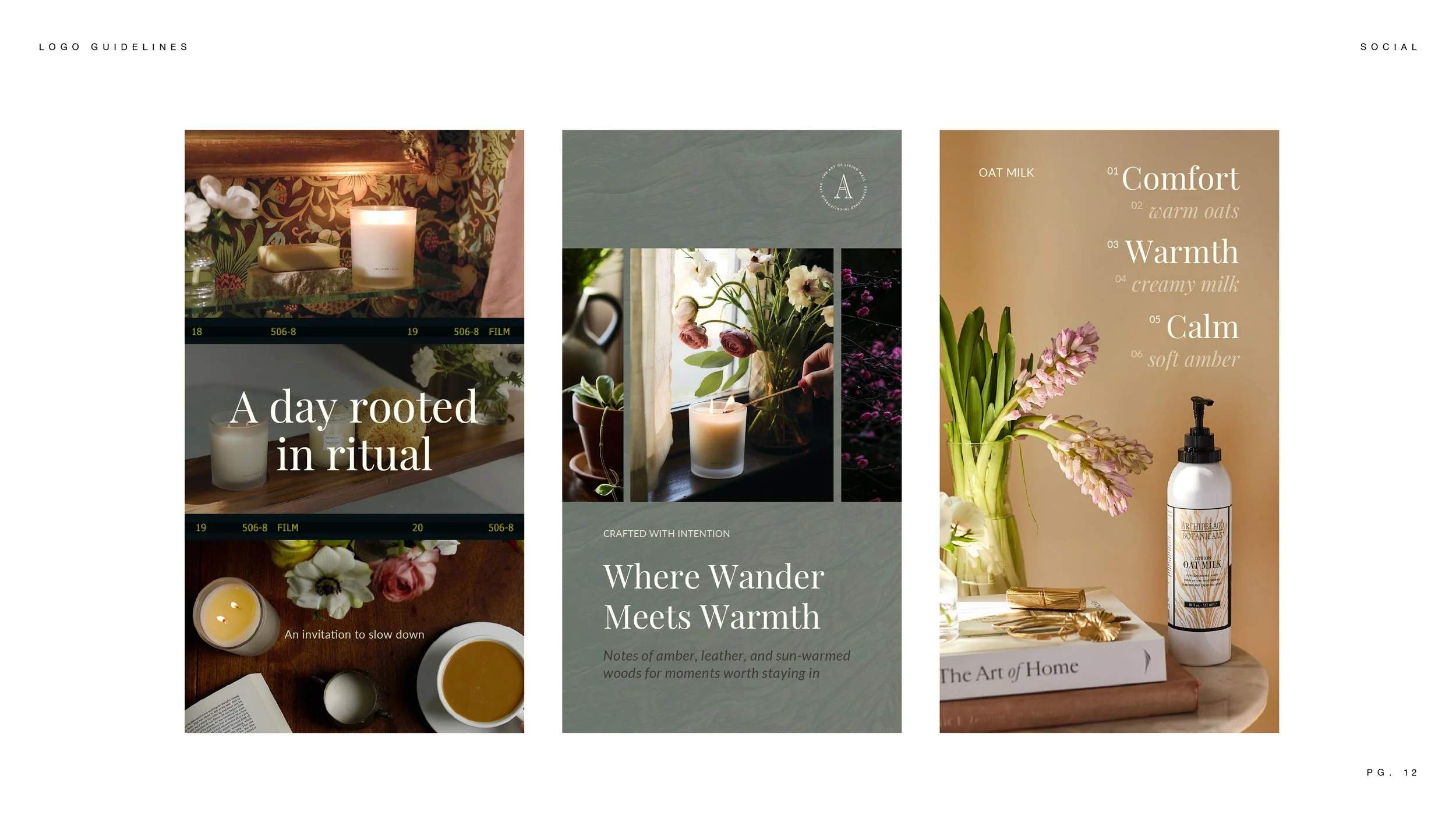
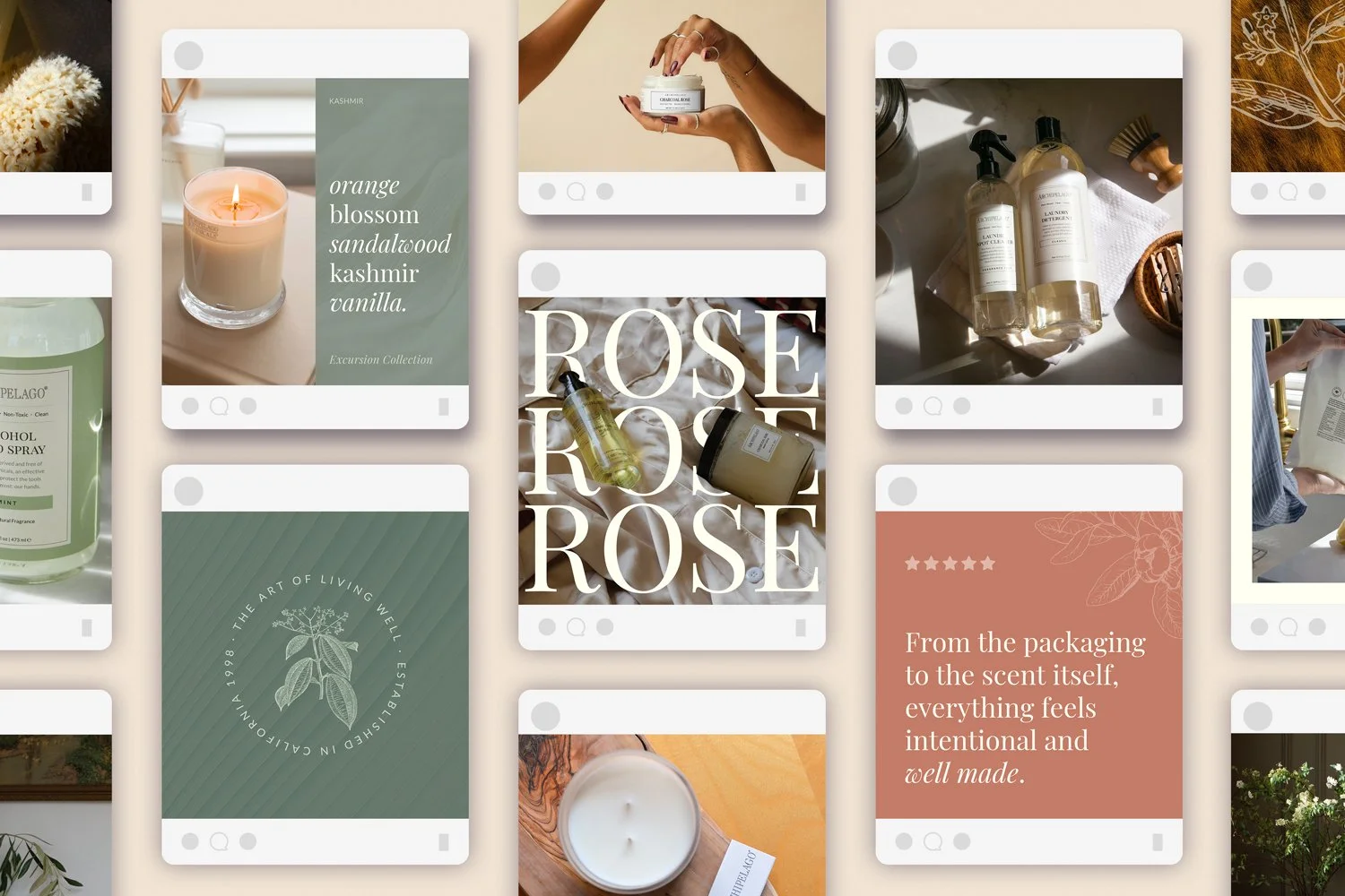
Carrying the System Into Social
Social content was designed to reinforce the identity through consistent typography, photography, and tone. Templates and visual guidelines allowed the brand to maintain cohesion across platforms while remaining flexible enough to support launches, education, and everyday storytelling.

Designed for Longevity
The work at Archipelago focused on building a brand system that could grow alongside the business. By establishing clear guidelines and applying them consistently across packaging, digital, and marketing touchpoints, the identity became easier to maintain, expand, and evolve over time.